THE ART OF LYNDA.COM
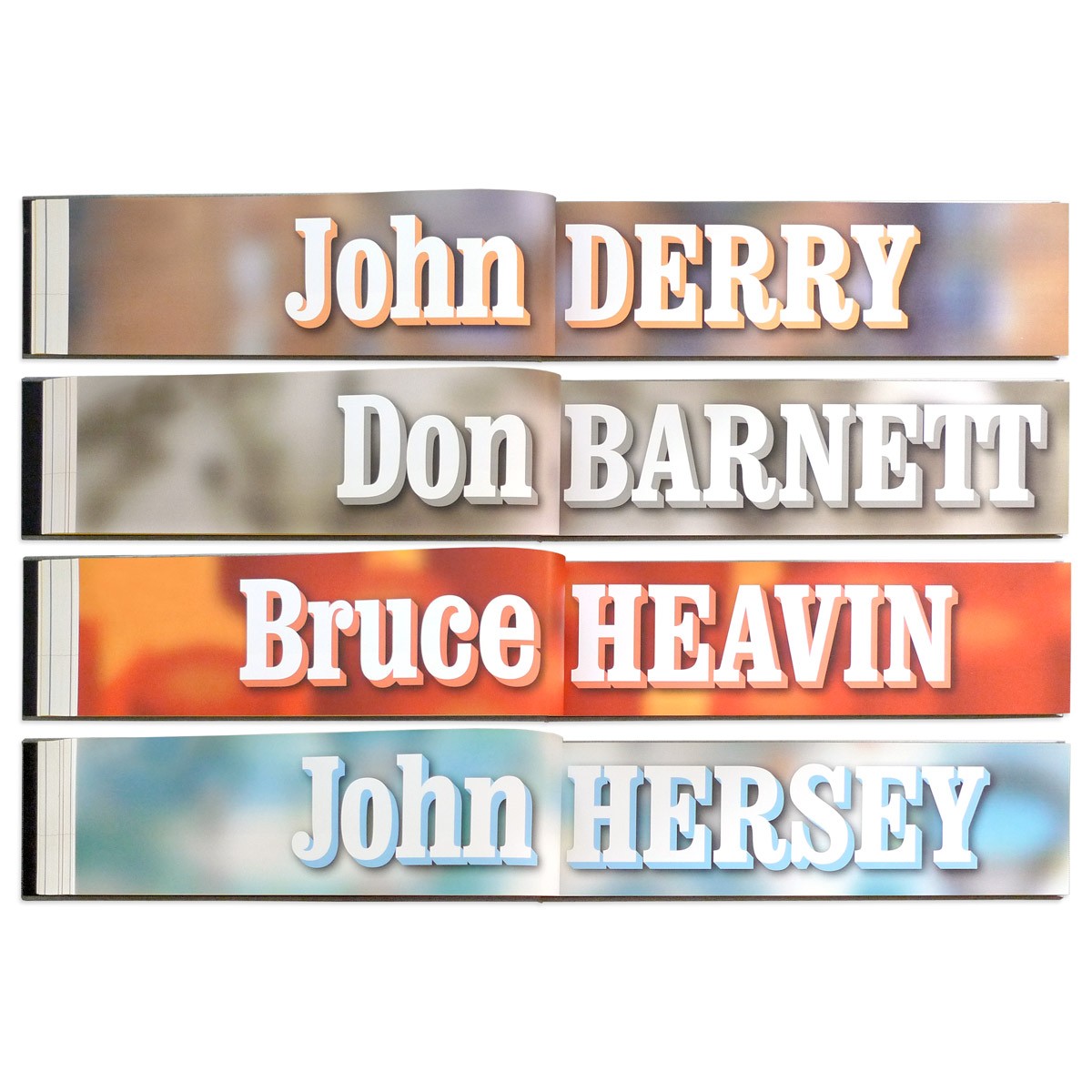
Lynda.com was an award-winning online learning company that has since been rebranded as LinkedIn Learning. While the vast majority of their offerings live online, Lynda.com still produced a line of classes on DVD. Lynda.com founders Lynda Weinman and Bruce Heavin used the DVD cases as a chance to work with some of their favorite illustrators. Over the years they had commissioned Don Barnett, John Derry, Richard Downs, and Maria Rendon to create custom artwork for the series.
Being an Art Center trained illustrator, Bruce also contributes his own covers. The company asked me to select my 100 favorite pieces from this collection, and gather them into a 242-page limited edition book—THE ART OF LYNDA.COM—that would be part of a holiday gift basket for their employees.
Finding the Perfect Format to Fit the Content
On that basis, we set the edition size at 500. This allowed us to print the book as 6-color separations on an HP Indigo digital press, which can achieve far brighter colors than regular CMYK offset printing, allowing us to better showcase the range of highly saturated, incredibly varied illustrations in the series.
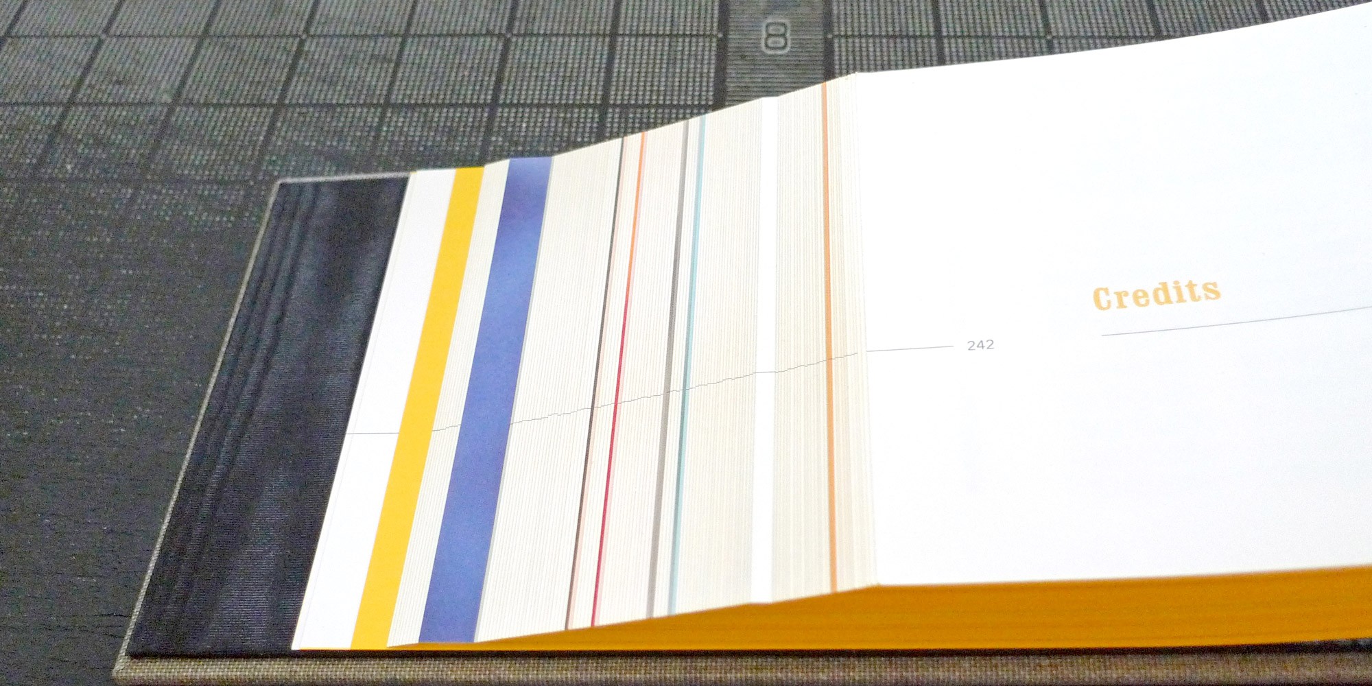
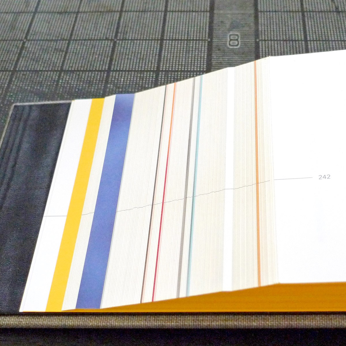
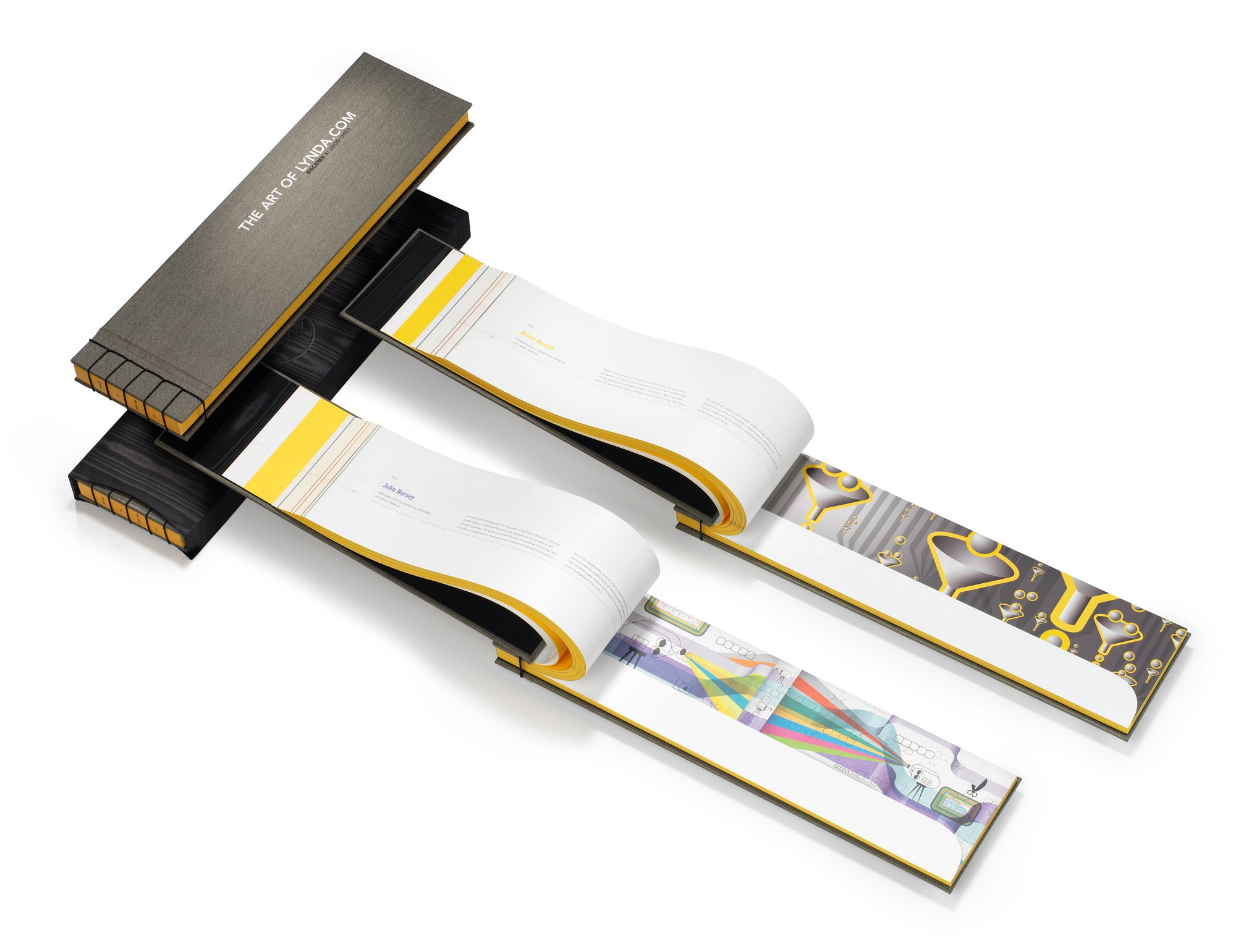
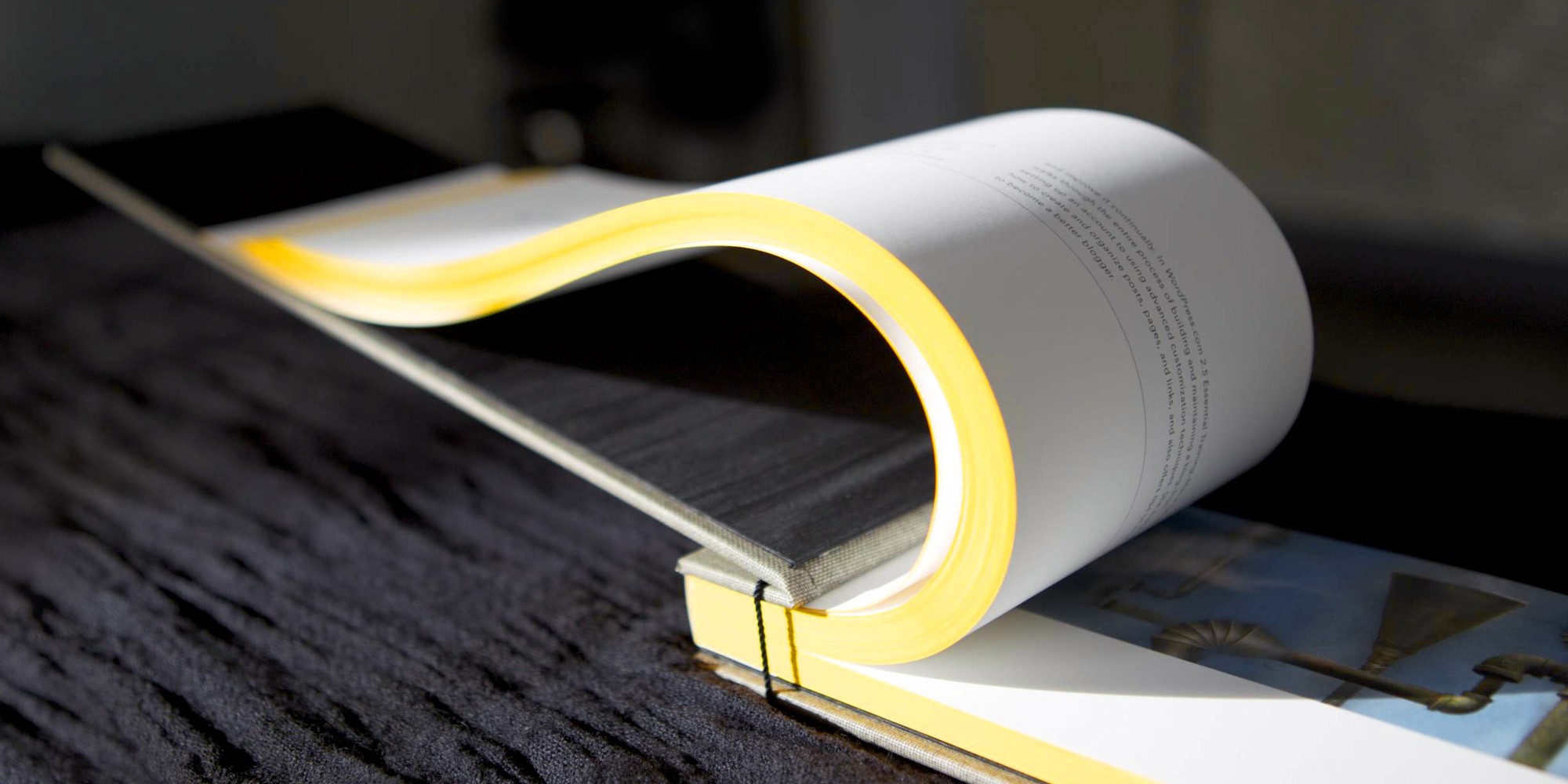
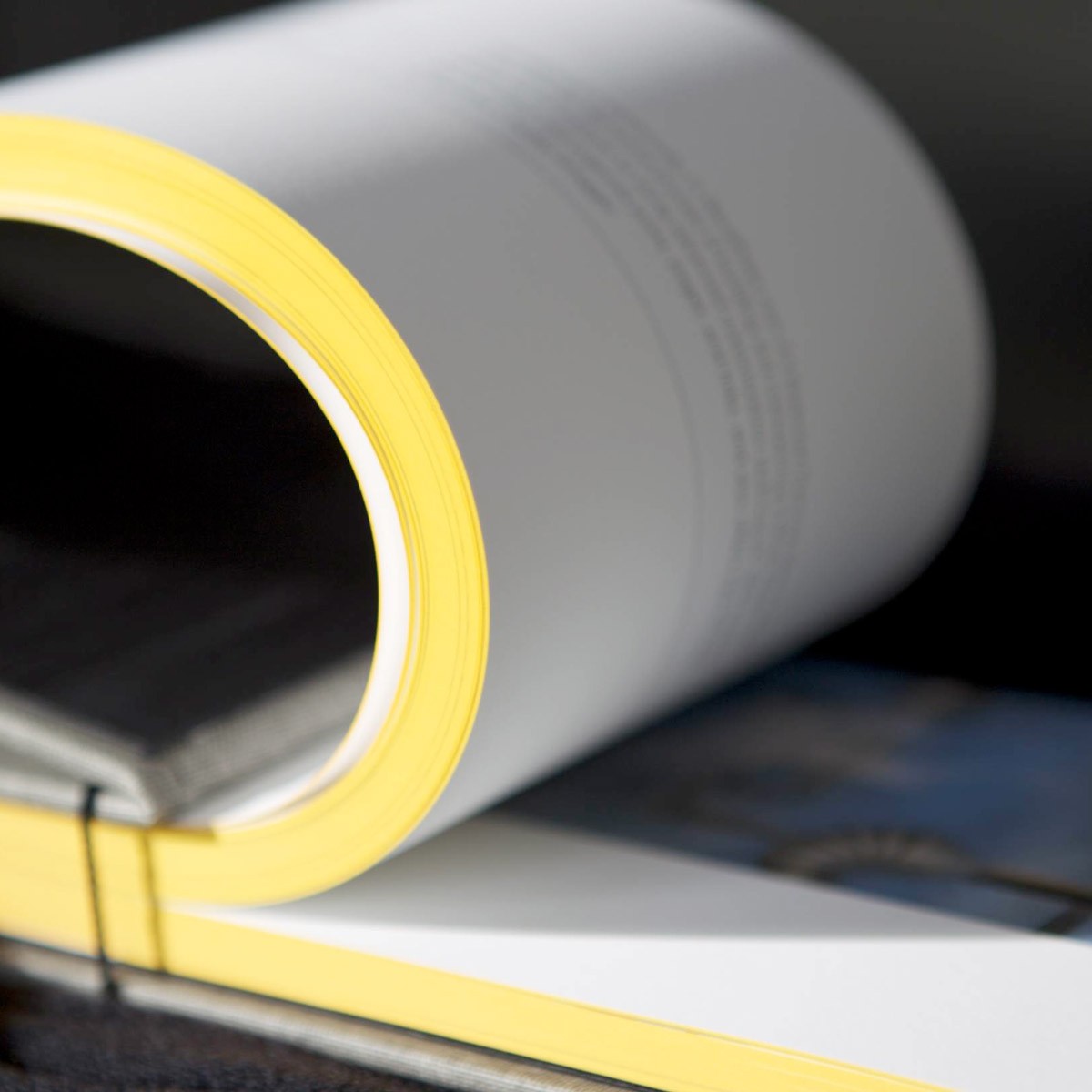
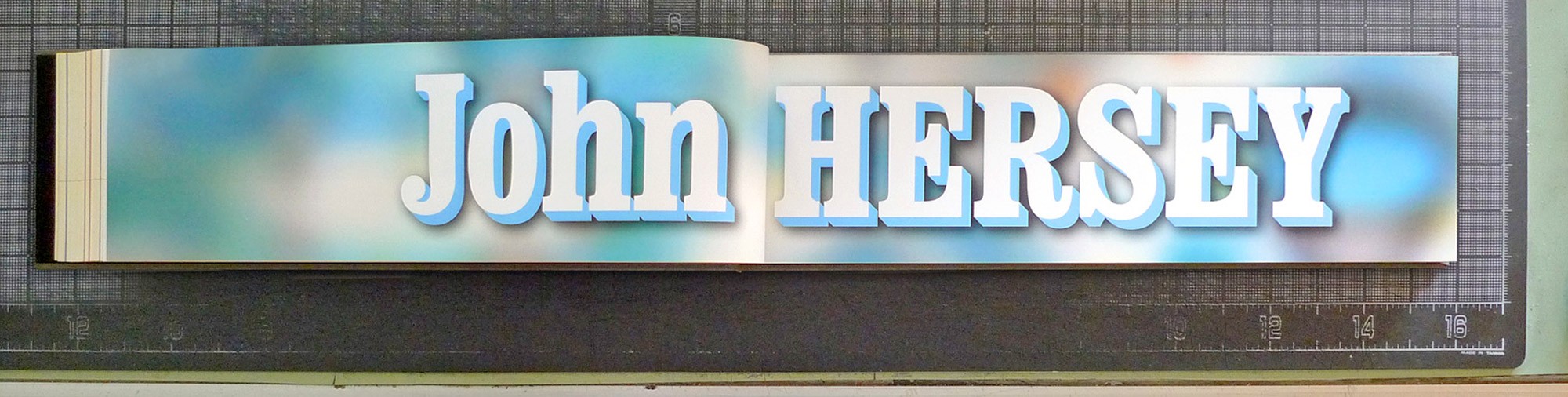
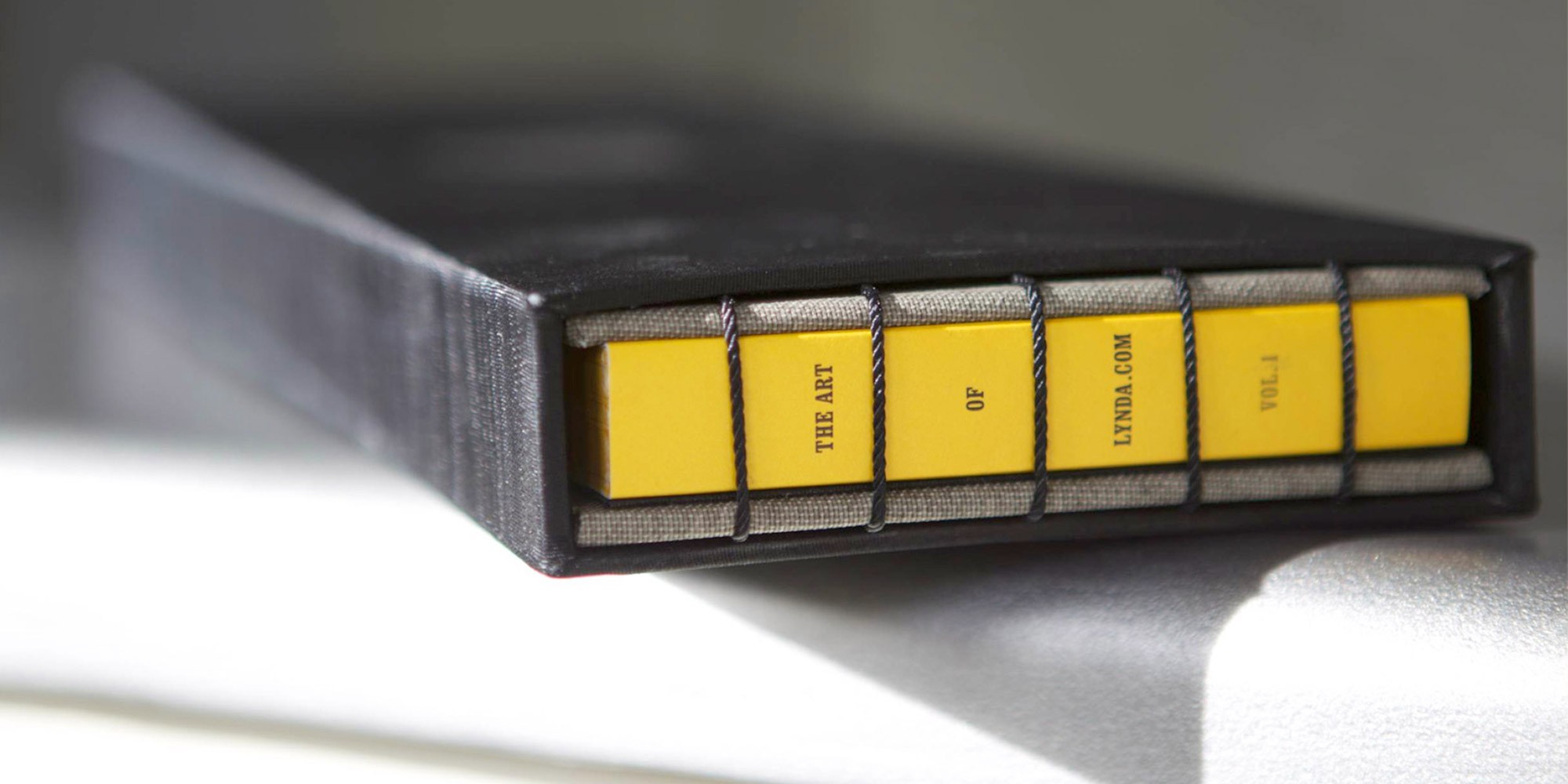
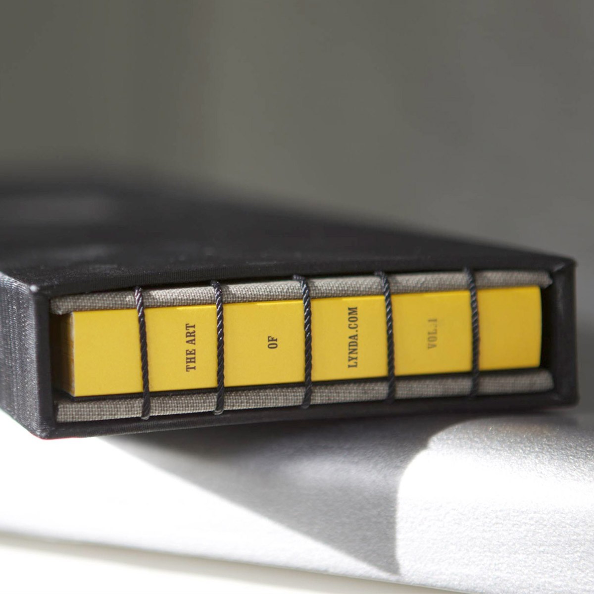
The artwork itself dictated the format. All the DVD illustrations originally lived as a slim band that runs along the top edge of each case, ending in a little curved hook at the bottom right. To show the illustrations properly, the book needed to have an extreme Cinemascope format. We settled on 16×4.25 inches (40.7×10.8 cm).
Making the Perfect Format Work
So large was the format that we couldn’t print even 4-page signatures on the Indigo, which was limited to 13×19 inches (33×48.3 cm) prints. Even though we had to go page by page, we didn’t want to perfect bind the book, as it would've lacked the necessary durability and feeling of luxury. Instead, we decided on a beautiful Coptic stitch binding.
Having stiff cover- and backboards lends the book stability, and a custom slipcase protects the whole thing. Binding a book weighing in at over 2.5 lbs. (1.13 kg) with a 5 inch spine created a structural issue: If you picked up the early prototypes you’d get a fan of pages drooping out of the bottom of the book. This would not do.
We tightened the binding. We added more holes for the Coptic stitch. We tightened the binding more. We got nowhere. Finally, our bookbinders suggested that we perfect bind the book and then add the Coptic stitch. This represented a tradeoff between aesthetics and usability. One of the great joys of the Coptic stitch is that you get to see the raw fore-edge of the book. Which we were painting Lynda.com yellow. But it had to be done.
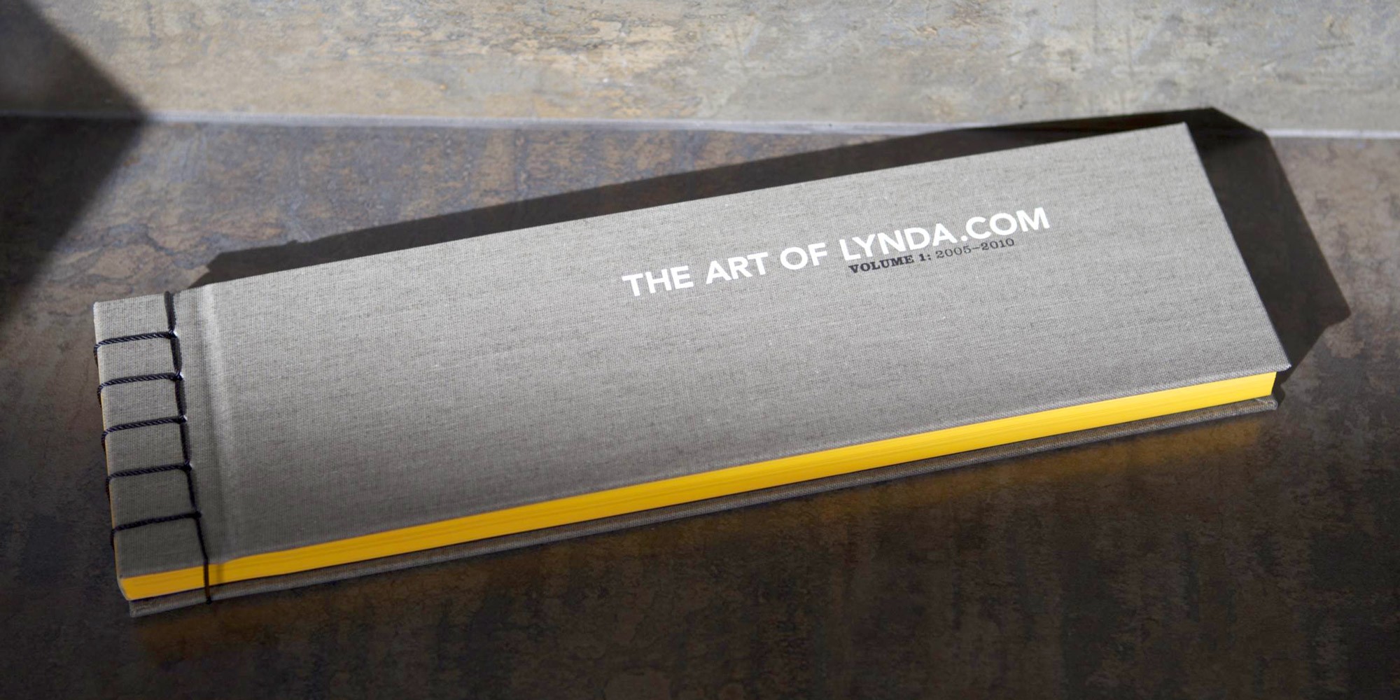
So we quickly printed 500 matching yellow spines for the purpose. But instead of simply adding a blank yellow edge, we seized the opportunity to turn a setback into an advantage: We inserted the title of the book between the binding string. This was a challenge for the bindery, as the binding thread doesn't usually have to align with any design elements, but our vendor came through with flying colors!
The book was finished with registered two-color foil debossing on a linen cover, and a company seal deboss on the silk-covered slip case. It’s rare to have such an unusual form factor executed in lavish materials with several production special effects, but Bruce and Lynda wanted this book to be a real treasure for their team, so we pulled out all the stops!
Making Maximum Use of the Process
A nice side effect of printing digitally was that we could send finished, trimmed book blocks to the bindery. (Book blocks are the stacks of collated pages that get bound and covered.) The interior page design prominently features bleeding hairlines. With regular offset printing, pages are printed on a large sheet in groups of 8, 12 or 16 pages. These sheets are then folded into booklets called signatures, gathered in sequence, and trimmed to the final size. This process creates some misalignment from page to page. In this case, those hairlines bleeding off the edge would dance all over the place when you fan the finished pages.
Because we could provide finished blocks—all pages trimmed in order—it’s one solid line along the left fore-edges. Everything aligns perfectly from page to page. For large segments of the audience, these are touches of quality that may not rise to the level of consciousness—"Wow! Look at that!"—but they contribute to an experience of quality and luxury.
The whole book is a union of new technology and old world craft, and a reflection of Bruce and Lynda's steadfast commitment to uncompromising production values.